All insights
Website Accessibility (WCAG) Guide: Make Your Site Usable for Everyone
A practical website accessibility guide based on WCAG: contrast, keyboard navigation, alt text, forms, headings, and testing, with why accessibility also improves SEO and conversions.
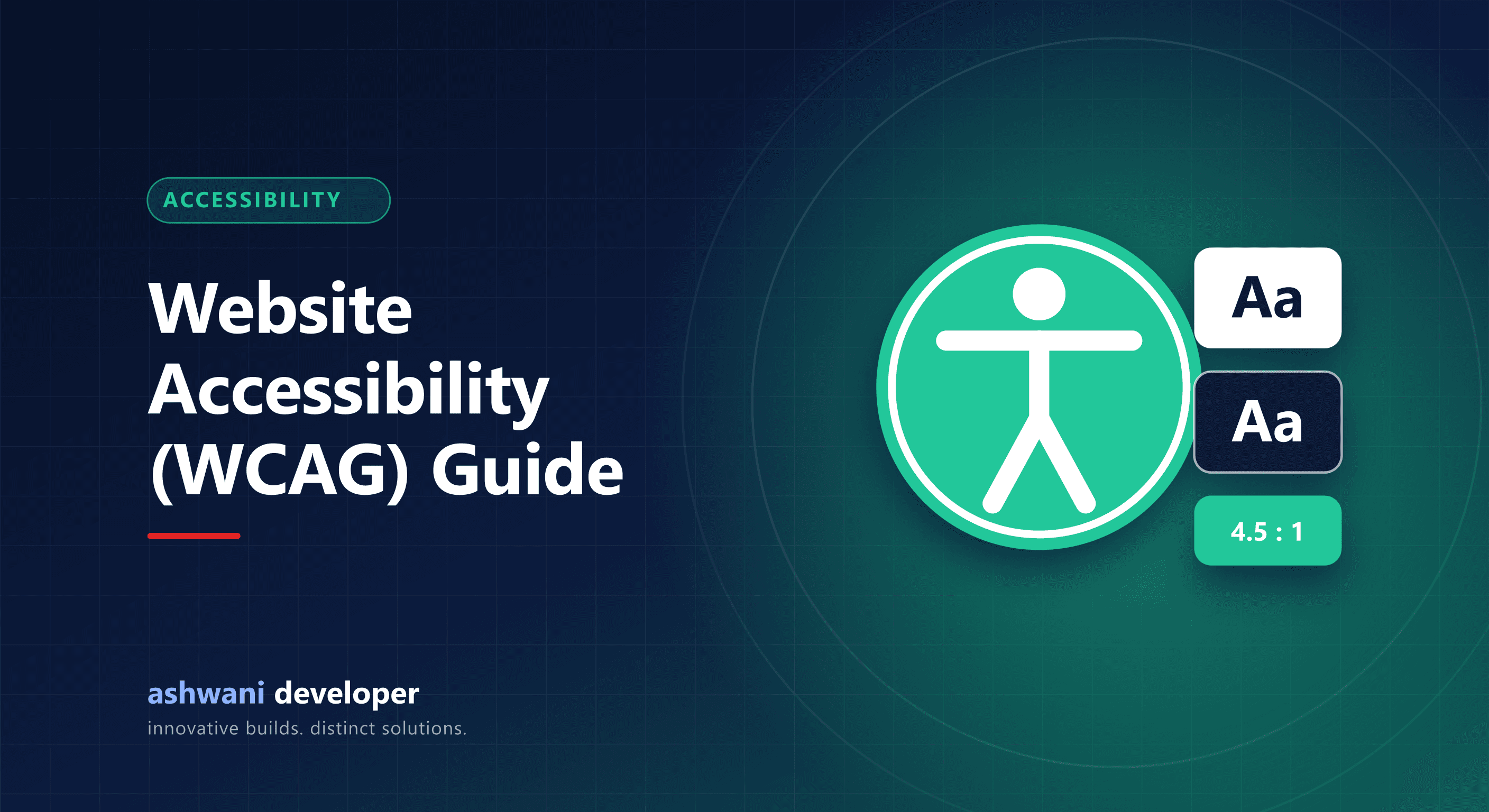
Quick answer: an accessible website can be used by people with visual, hearing, motor, or cognitive impairments. Start with sufficient colour contrast, full keyboard navigation, meaningful alt text, labelled form fields, logical headings, and captions for video. These follow the Web Content Accessibility Guidelines (WCAG) and usually improve SEO and conversions too.
Why it matters
- People: a significant share of users have a disability, and many more have temporary or situational limits such as bright sunlight or one free hand.
- Business: an accessible site reaches more customers and converts better because it is clearer for everyone.
- SEO: alt text, headings, and descriptive links help search engines understand content.
- Compliance: government and public-sector websites in India follow accessibility guidelines, and accessibility expectations are growing for private businesses too.
The practical checklist
Visual
- Text contrast of at least 4.5:1 against its background (3:1 for large text).
- Do not use colour alone to convey meaning, such as red for errors without text.
- Text can be zoomed to 200% without breaking the layout.
Keyboard
- Every link, button, menu, and form works with Tab, Enter, and Space.
- Focus outlines are clearly visible; never remove them without a replacement.
- Popups and menus can be closed with Escape, and focus does not get trapped.
Content
- Descriptive alt text for meaningful images; empty alt for decorative ones.
- One H1 per page and a logical heading order.
- Link text that makes sense alone; avoid "click here".
- Captions for videos and transcripts for audio.
Forms
- Every field has a visible label.
- Errors are explained in text, next to the field, and announced to screen readers.
- CAPTCHAs offer an accessible alternative.
Structure
- Use semantic HTML: header, nav, main, footer, buttons that are real buttons.
- Set the page language attribute.
- Respect reduced-motion preferences for animations.
How to test
- Run an automated check with Lighthouse or an accessibility browser extension.
- Navigate the whole site using only the keyboard.
- Try a screen reader such as NVDA on Windows or VoiceOver on Mac and iPhone.
- Zoom to 200% and test on a small phone.
Automated tools catch only part of the issues, so manual testing matters.
Build it in, not on
Accessibility is far cheaper when designed from the start than retrofitted later. It pairs naturally with good UX; see website design mistakes that reduce enquiries.
Want an accessibility review? See UI/UX design or share your website.